

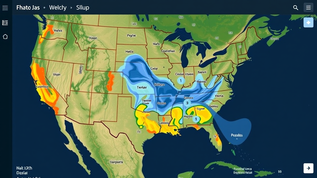
Deep in the Amazon, where weather stations are scarce and satellite dishes are often the only witnesses to a storm’s birth, a team of Brazilian researchers has built a tool that turns freely available global forecast data into a living, breathing map of the atmosphere. The system, called DatavizAmz, was developed by the Study and Research Group in Big Data at the University of São Paulo and is described in a new paper published in the journal SoftwareX. It is now available as open-source code under the MIT license, meaning anyone from a small environmental nonprofit to a regional emergency agency can download it, adapt it, and start painting the sky in high definition.
The motivation behind the project is refreshingly practical. The São Paulo group had long relied on publicly available web applications to visualize the meteorological datasets that underpin much of their research, from railway maintenance studies to climate analytics. But those third-party tools kept falling short: missing weather variables, inadequate spatial coverage, and rigid interfaces that could not be tailored to the regions the scientists actually cared about. Rather than continue patching together imperfect solutions, the team decided to build its own application, one that would let them define custom areas of interest, add any climate variable their studies required, span wide date ranges, and produce graphics that clearly communicate atmospheric conditions.
What began as an in-house utility in the early 2020s has matured into something with far broader significance. In many parts of the world, establishing and maintaining a dense network of physical weather stations remains financially and logistically out of reach. For academic labs, educational institutions, and small non-governmental organizations, open-access numerical weather prediction datasets from global modeling centers are often the only continuous source of environmental information. Yet a stubborn gap separates the raw, high-volume data archives that agencies publish from the lightweight, real-time visual assets that non-specialists can actually use. DatavizAmz was designed to close that gap, offering spatial visualizations without heavy local server overhead or a dedicated geographic information systems engineering team.
Under the hood, the system is a study in elegant frugality. The backend is a Python script that taps into the National Oceanic and Atmospheric Administration’s open data dissemination program, pulling output from the Global Forecast System, the flagship American weather model. NOAA runs GFS in four daily cycles, initiated at 00:00, 06:00, 12:00, and 18:00 UTC, and each cycle generates forecasts stretching up to sixteen days into the future. The data arrive as GRIB2 files, a binary format standardized by the World Meteorological Organization that efficiently packs enormous volumes of georeferenced atmospheric grids but is notoriously difficult for ordinary software to handle. DatavizAmz decodes these files using the Herbie library together with the Xarray package, extracting only the two-dimensional surface slices the dashboard needs.
Herbie brings a clever trick to the table: instead of downloading an entire GRIB2 file, the library reads a remote index file that maps the exact byte offsets of every variable and atmospheric layer inside the binary container. It then issues targeted HTTP range requests to fetch only the specific fragments required, discarding the rest before transmission. If NOAA’s primary NOMADS servers are slow or down, Herbie automatically falls back to high-speed cloud mirrors hosted on Amazon Web Services or Google Cloud. This byte-level surgery keeps bandwidth costs low and storage footprints tiny. A complete forty-eight-hour visualization cycle for the team’s Amazon monitoring region produces a payload of roughly sixteen megabytes, small enough that no persistent database system is needed at all.
The raw GFS grid arrives at a resolution of 0.25 degrees, which translates to a spacing of about twenty-eight kilometers near the equator. For the Amazon bounding box the team monitors, stretching from 4.125 degrees north to 12.125 degrees south and covering roughly twenty-eight degrees of longitude, that means an input matrix of just 66 by 114 grid points. To make the visuals seamless, the pipeline upsamples the grid by a factor of four, yielding an effective resolution of about seven kilometers and an output matrix of 264 by 456 pixels. Before resampling, a Gaussian filter with a standard deviation of 1.0 across a five-by-five kernel window strips out high-frequency noise. The choice of interpolation method is deliberately physics-aware: bicubic interpolation smooths continuous thermodynamic variables like temperature and relative humidity, while bilinear resampling is reserved for fluxes and vector quantities such as wind and precipitation, precisely to prevent non-artifacts like negative rainfall or phantom wind spikes near sharp gradients.
The most eye-catching feature of the dashboard is its particle-based wind animation, which renders the atmosphere as thousands of drifting streamlines over a satellite basemap. To achieve this without crushing browser performance, the system encodes wind velocity into the red and green channels of an ordinary PNG image, with the east-west and north-south components normalized across a range spanning minus forty to plus forty meters per second, equivalent to 144 kilometers per hour in each direction. When a frame loads, the JavaScript engine draws the image onto an offscreen canvas, scans the pixel array, decodes the byte values back into velocity vectors, and then sets 2,500 virtual particles loose across the grid. Each particle queries the decoded wind field at its location, advances, and leaves a color-coded streamline behind, while a semi-transparent overlay brush applied each frame creates the trailing fade that makes the flow feel continuous. The particle count is configurable, so users on older hardware can trade animation density for smoother frame rates.
The team did not simply trust the pipeline; they verified it quantitatively. Across 7,524 raw grid nodes, they measured the numerical distortion introduced by upsampling and smoothing. For two-meter temperature, the mean absolute error came out to 0.08 kelvin, with a root-mean-square error of 0.12 kelvin and a maximum local error below 0.45 kelvin along sharp frontal zones. Ten-meter wind velocity showed a mean absolute error of just 0.05 meters per second. Non-negativity constraints on precipitation are strictly enforced after interpolation, and the low-pass filtering damps extreme point peaks by less than 2.8 percent. Georeferencing was cross-validated against high-resolution vector lines of the Amazon mainstem and its major tributaries, confirming sub-pixel spatial registration with no coordinate system misalignment. Automated unit tests covering these checks ship with the repository.
There are honest limitations, and the authors enumerate them. The system is built around the deterministic single-run GFS model at its fixed 0.25-degree resolution, so it cannot capture fine-scale convective dynamics the way regional models can, and it does not visualize forecast uncertainty the way ensemble systems like GEFS would. The smoothing that makes the visuals beautiful also acts as a low-pass filter that slightly softens localized extremes. The pipeline depends on the continued availability of NOAA’s data endpoints and the upstream Herbie framework, and there is an inherent lag of roughly three and a half to four hours between each model cycle and the completion of data publication. The developers are candid that the upscaled, filtered outputs are intended for visual rendering only, not for generating novel high-resolution microclimate datasets or replacing raw model forecasts in quantitative meteorological budgeting.
Still, the implications reach well beyond one research group in São Paulo. Previous versions of DatavizAmz have supported the team’s projects since 2022, and by simply editing a handful of configuration variables, latitude and longitude bounds, zoom level, frame count, the team has already repurposed the system to monitor the state of São Paulo as easily as the Amazon. A live implementation runs on the university’s servers, displaying a rolling forty-eight-hour window of temperature, relative humidity, wind gusts, precipitation, and flowing wind particles. The authors sketch a roadmap for community contributions: archiving historical data with a date selector, an interactive click-and-drag region selector, additional climate variables, alternative forecast models, and an extended visualization horizon reaching the full sixteen days that GFS provides. For resource-constrained institutions watching flood seasons, droughts, or storm systems in data-sparse corners of the planet, an open-source window into the atmosphere may prove to be one of the most quietly consequential tools to emerge from the open weather data movement.
Subject of Research: An open-source meteorological data pipeline and interactive WebGIS dashboard for visualizing NOAA GFS forecast data in the Brazilian Amazon
Article Title: DatavizAmz: Operational pipeline and interactive web dashboard for high-definition meteorological visualization in the Brazilian Amazon
Article References: Gogliano Sobrinho, O., de Queiroz, W. D., Pizzigatti Corrêa, P. L., dos Santos Motta, R., Moraes Pereira, P. A., & Nascimento Maia, C. (2026). DatavizAmz: Operational pipeline and interactive web dashboard for high-definition meteorological visualization in the Brazilian Amazon. SoftwareX, 36, Article 103048. https://doi.org/10.1016/j.softx.2026.103048
Image Credits: AI Generated
DOI: 10.1016/j.softx.2026.103048
Keywords: DatavizAmz, Brazilian Amazon, NOAA, Global Forecast System, GRIB2, weather visualization, WebGIS, open-source software, Herbie, MapLibre, wind particle animation, University of São Paulo
Cite Scienmag News
Denise Maddox. (September 25, 2026). Open-Source Dashboard Turns Raw NOAA Forecast Data Into Live Amazon Weather Maps. Scienmag. https://scienmag.com/open-source-dashboard-turns-raw-noaa-forecast-data-into-live-amazon-weather-maps/
Denise Maddox. "Open-Source Dashboard Turns Raw NOAA Forecast Data Into Live Amazon Weather Maps." Scienmag, 25 September 2026, https://scienmag.com/open-source-dashboard-turns-raw-noaa-forecast-data-into-live-amazon-weather-maps/. Accessed 4 October 2026.
Denise Maddox. "Open-Source Dashboard Turns Raw NOAA Forecast Data Into Live Amazon Weather Maps." Scienmag. September 25, 2026. https://scienmag.com/open-source-dashboard-turns-raw-noaa-forecast-data-into-live-amazon-weather-maps/